10% Annual Stock Market Return? Not by this Metric.
I was 19 when I read “The Motley Fool Investment Guide for Teens: 8 Steps to Having More Money Than Your Parents Ever Dreamed Of.” Fresh out of high school and with a drive to succeed in the business world, I was inspired by the down-to-earth advice that the book recommended, things like setting goals, saving money, and avoiding financial mistakes like racking up high-interest credit card debt. That all made sense, but what really caught my eye was the simplicity of the investment strategy: Put your savings in a Vanguard index fund and enjoy doubling your money every seven years (10%+ return).
That made me ponder: “10% a year sounds great in theory, but is looking in the rear view mirror really the way to invest?” I didn’t find the answer to this right away. Instead I went through a the painful transition from the Peak of Inflated Investing Expectations to the Trough of Investment Disillusionment. It was only when I first read John Hussman’s original and detailed work on market valuations that I found my answer. Using mathematical inference, he found a way to predict future stock market returns using the ratio of two economic indicators: [Market Capitalization] / [Economic Gross Value Added]. While similar to other valuations like the “Buffet Indicator,” it proved superior in its ability to predict future returns thanks to having the highest correlation with actual market returns of any metric.
Interestingly, when the Motley Fool book was written in 2002, the [MarketCap]/[GVA] predicted a 12-year annual return of 9.4%, and the market actually achieved 10.3% from 2002-2016. Not bad! But since then, stock prices have significantly deviated from the underlying economic fundamentals and (as of Aug, 2020) the ratio is forecasting a 12-year return of -1.5%. That’s per year, not total, and that’s AFTER dividends! Total return over 12 years would add up to -17%, and the metric has historically had a 93% correlation with actual returns.
Skeptics of Hussman will rightly claim that his fund has nightmarishly underperformed in the 2010s. While this is true, I don’t think it invalidates his economic research for an investor who takes a full-cycle, long-term approach. In other words, let the full economic cycle play out before drawing conclusions. As of August 2020, we are experiencing the first recession since 2008, so the chickens might finally be coming home to roost.
The dashboard above reproduces some of Hussman’s work in a real-time and interactive fashion. It is structured with the business user (the investor) in mind. Each navigation tab on the left answer a business question. For example: “what would the projected return be if the S&P 500 dropped to 1500?” In addition, each section has a help pane with further detail about how to analyze the information. The data is updated daily at 4pm Central Time.
Conclusions and Takeaways
Stocks can be so richly valued that future returns are depressed to 0%, or even to negative levels.
If you are a long-term investor, ask yourself if you’ll have the fortitude to stomach the possible long-periods of negative returns without abandoning your strategy.
Technical Discussion
This dashboard hides quite a bit of complex math in order to generate the Market Cap / GVA valuation metric. Most of this was adapted from Hussman’s work, but I added some original analytical features to more easily use this information to make personal investment decisions.
Automated Power BI alerts
As an investor, I developed a portfolio management strategy to allocate more to stocks as valuations favor higher returns. However if I check this on a daily basis, I find it easy to get sucked into the day-to-day price movements which can be detrimental to sticking to a strategy, particularly when prices are dropping fast. To avoid this, I created a set of automatic Power BI alerts which email me whenever the Market Cap / GVA ratio hits particular levels.
To accomplish this, I created two measures, one that calculates the ratio for today and a second which calculates the ratio for yesterday. For example, if the ratio is 2.27 today and was at 2.23 yesterday, the measure returns “TRUE” because it crossed a defined threshold of 2.25. I display the threshold that was crossed in a Power BI card visual which is “pinned” to a Power BI Dashboard in my tenant. Once that’s in place I can easily set up an alert to email me the card visual changes.
Predicting expected returns at various S&P 500 levels
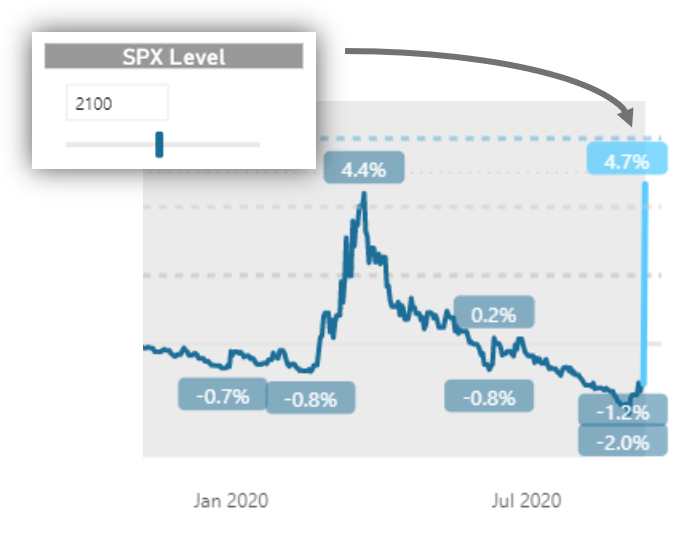
A big question I had when reviewing Hussman’s work was “what would the S&P 500 have to be at today to show expected returns of 10%?” It’s relatively easy to calculate this because the [Market Cap] portion of the ratio is based on the close price of the S&P 500 on each day. The trickier part is how to display this on a chart dynamically.
The way I approached this was to create two measures – one that calculates the actual ratio on all days except for the current day; the second measure calculates the ratio if SPX were at the selected slider level today. It’s trivial to display two measures on a chart, so then I simply add logic to hide the second measure (return BLANK() for predicted return %) if the user doesn’t select an SPX Level from the slider.
Multiple date ranges with a single slicer
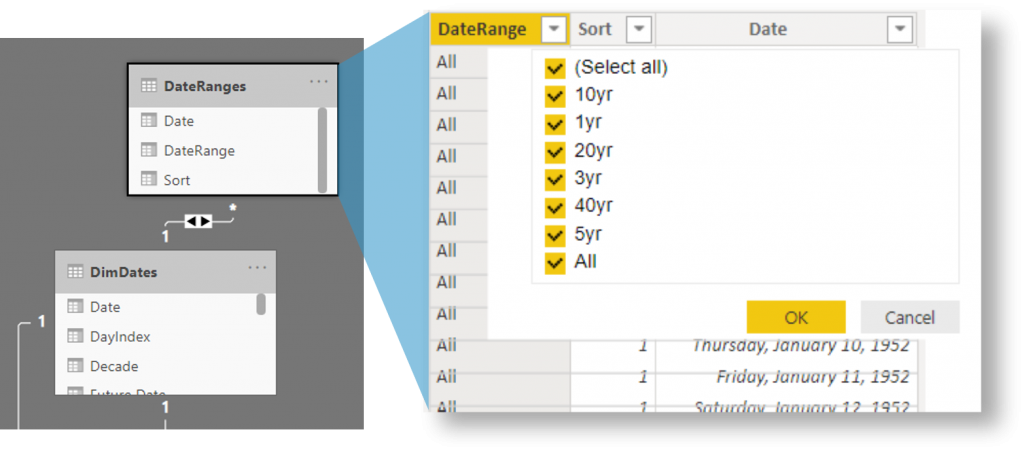
Instead of forcing the user to select a custom date range which can sometimes take more clicks than desired, I create a number of commonly used date ranges and provide this option to the user:
 \
\
The DateRanges table has multiple copies of each unique date, because the same date could apply to multiple date ranges. Let’s take today, for example. Today would apply to all date ranges, so each DateRange “scenario” will contain today’s date as a row. To tie this DateRanges table into the rest of the model, I connect it to DimDates (the primary date lookup table) and change the relationship to bi-directional so that setting a filter on DateRanges will automatically propagate the filter to DimDate and the rest of the model.
Multiple help panes with a single help button
The Power BI bookmarks feature gives you some great capabilities to build interactive stories into your reports but it can be tricky to tune. I wanted to have a single context-sensitive help pane that would show different text depending on which bookmark the user selects. Take a look at the report – click one of the tabs on the right, then select the help icon. Then select another tab followed by the help icon. You’ll see different help text. The standard way to achieve this would be by creating many different bookmarks and help text panes, but that quickly becomes a maintenance nightmare.
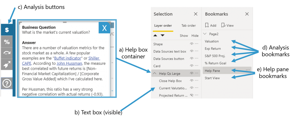
Instead, I created a single container (see (a) in screenshot above) which is made visible with a bookmark called “Help Pane” (e) and hidden with the bookmark “Start View” (e). I added a couple other elements to this help container such as a close X element. I then grouped these elements so that the bookmark could show/hide the entire container group.
The text boxes (b) with the actual help information are each separate, and initially outside the help box container group. For each analysis button (c), I manually show/hide the corresponding help text box and create a bookmark (d). Once the bookmarks are in place, the magic trick is to move the help text boxes into the overall container group (a), and now when I show/hide the container (e), it respects the original visibility settings I set for each text box.
0 Comments