Power BI Interactive Resume
The purpose of creating this interactive resume (CV) in Microsoft Power BI is to highlight some of my dashboard skills while letting potential employers or clients learn about my professional experience in a more interesting way than a traditional resume.
Faking a Gantt chart in Power BI
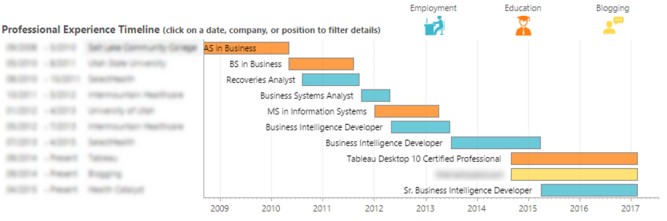
While developing this dashboard I ran into numerous roadblocks that highlight the fact that Power BI is still maturing compared to Tableau (its polished competitor). For example, I initially anticipated no problems in creating a simple timeline view of my work experience. In Tableau it’s easy to create a Gantt chart:
I searched the Power BI custom visuals gallery and found a promising Gantt chart visual. However it turned out to be very underdeveloped:
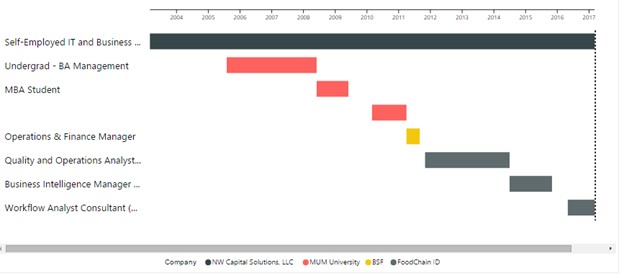
First, I couldn’t change the height of the bars and they took up excessive space in my report. Second, I couldn’t customize the bar colors. Third, the tooltips displayed extra info that I couldn’t eliminate like “Completion %.”
Disappointed, I researched additional options. The pulse chart custom visual looked promising because I could show milestones on a timeline:

However, the drawbacks were that I couldn’t show length of time worked at a given job, nor show categories (education, main full time job, part time side job, etc.) Also, I didn’t have control of colors of the dots to the degree I wanted.
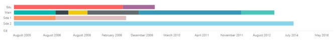
Not to be deterred, I put my effort into figuring out a way to mimic a Gantt chart for my Power BI resume. I had the thought that a Stacked Bar chart could replicate a Gantt chart if I were to insert dummy blocks that separated the real blocks. I began by making each Job a separate segment on the bar chart, split into the various categories (Education, Main, Part Time 1, Part Time 2):
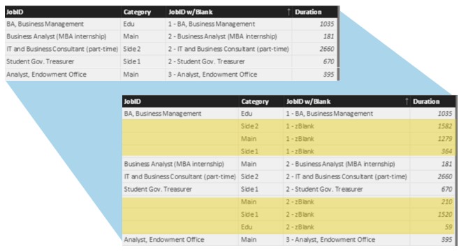
Now I needed to figure out a way to place blank dummy bars in between the actual job bars to show gaps in the timeline. To do this, I generated a calculated table using DAX (Power BI’s formula language for defining custom calculations). I started with a Date Table that included all dates between the earliest start date of any job minus one day (keep this in mind because I’ll come back to this) and the latest end date of any job. For each of these dates, there could be one of four job categories (Education, Main Job, Side Job 1, Side Job 2), so I calculated the Cartesian product of these two datasets, resulting in a table with four times as many dates.
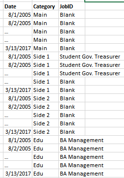
Using the DAX SUMMARIZE function, I collapsed that table back into a simple list of jobs that included any employment gaps precalculated as “jobs.”
When I used this new table as the source data for the Stacked Bar Chart in Power BI (using the duration column to specify the width of the bar on the visual), I got something like this:

Then, I changed the color of all the dummy “jobs” to White:

Adding the date axis to a Power BI stacked bar chart
You might be wondering how I simulated a date Axis on this chart. Remember that earlier when I created the calculated table with all dates I expressly increased the date range by one day earlier than the earliest start date. That way, PowerBI sees a gap BEFORE the first job in every category. To each of these initial gaps, I added roughly 2005 years to their duration:
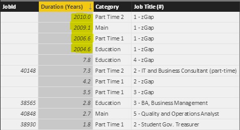
I set the bar chart X-axis to begin at value 2006. With a bit of formatting (removed decimals and commas from the X-Axis) I got something like this:

I was pretty happy with it! Because the visual is a standard Power BI bar chart, I can click on each bar segment to highlight/filter the rest of the report. It took a lot more hacking than should be necessary, but in the end I was happy to have achieved the Gantt Chart effect I was going for!
Narayana! This interactive CV is simply superb! I love how the applicable skills changes with each click to show how versatile your talents are with each accomplishment.
Only thing I would do is lose the striped tie! Does the smaller picture of you just show the lavender shirt open, and no tie? That’s what it looks like to me, and it looks much much better than the striped tie.
This website should actually land you in a major metropolis somewhere. My first feeling was that you are heading for New York! But it would be awesome if you could end up somewhere gorgeously picturesque with lovely views, tons of money, and peaceful surroundings in which to work–not New York! (But the energy there is pretty exciting).
You are an amazing young man. I hope you land a career or the best clients of your dreams as soon as you wish!